FILM REVIEW: ‘In Praise of Drawing’
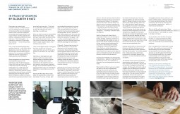
Film review by Professor Elizabeth Hatz in Architecture Ireland, no. 275, Summer 2014. (Click the image for a PDF version of the review.)
What is thin, black, fits in your pocket and never lets you down – even when you are miles out of coverage? – a sketchbook. Leonardo da Vinci’s best advice for anyone who wants to learn from reality (like an artist) is to walk around and observe and sketch as you walk, registering what you see on your way. (from Thinking is Form, The Drawings of Joseph Beuys)
A couple of years ago, entering José Linasasoro’s church ruin turned into a beautiful library in Madrid, our students from SAUL Limerick, in the silence of the room, immediately picked up their little black notebooks and started sketching in attentive peace for the couple of hours we were there, guided by the architect. Linasasoro turned to us, mouth wide open; “I don’t believe this – no architecture students at ETSAM hand draw anymore… – I am so envious! How do you do it?” Well, we heard the teacher of hand drawing at ETSAM, had just retired – with no replacement.
Hand drawing young architects might be a particularly Irish phenomenon. And one we have good reason to both develop and disseminate around the world. Just as some Irish architecture makes triumphal arrivals across the globe. That the two phenomena are linked, I am sure.
But you will ask isn’t hand drawing totally obsolete in days of the immediacy and sophistication of smart phones and laptops? No – and it never will be, despite the current lack of practice. Just as little as the book really killed the cathedral, just as little as the television really killed the book and just as painting has come back, after being momentarily suffocated by installations. The world just gets more complex: so, let’s embrace that co-existence and complexity.
The lack of hand drawing and the position of Irish architecture in the world now, make the film “Drawing on Life” by Paul Clarke and Conor McCafferty an important cultural undertaking. It can potentially spread widely. One certainly wants to show it to colleagues, friends and students – for many years and all around the world.
Paul Clarke takes us on a deep, direct and unpretentious encounter with hand drawing in architectural practice through conversations with prominent practices and individuals, alternately from the Republic and the North. McCafferty’s camera is gentle and complex; superimposed shots of what we actually see every day – if we look – IF we look… It is a good, slow flow, careful and sensitive. The pace is gentle and allows for reflection. It recalls sketching, in a subtle way.
When you sketch or draw your pace is automatically slower than when you take snap shots with your smart phone; you have to think – and – your hand has to think. You CAN actually do this also with your phone; I mean THINK, pause, observe, linger, register, choose…. But normally you just won’t. This is why it is important to keep observing by actually manually drawing. Period. And it is different.
Some years ago in New York, as part of a review panel at Cooper Union in Peter Eisenman’s 2nd year studio, I was amazed to see his young talents make speculative geometric analysis of Borromini – in huge hand drawings and wooden models. Already then Eisenman was deep into computers in his work; but here he was speaking about the importance of the hand’s relation to the brain. He knew exactly how he wanted to make the students develop a sophisticated understanding of three-dimensionality and spatial complexity, as well as learning to observe attentively and register with geometric refinement: through the labour of drawing by hand they became ten times stronger also at the computer.
There are two different words in Portuguese that mean “to look” and “to see and understand” (olhar and ver). The tool of an architect is to be able to see” says Álvaro Siza.
Sketching and drawing is a heterogeneous activity: and it is OPEN. A sketch may mean totally different things to the author and the spectator: yet they seem to meet – somewhere in the imperfect, elusive and attentive zone between image and thought.
Nigel Murray opening the film, talks about the unpretentious format of the sketchbook. I think it is a key. A cheap, light and sustainable companion for anyone aged 5 to 95, to play, observe, think or muse. Michael Doherty is filmed sitting and drawing people using the city; through the sketch he observes how places are appropriated. He has 3 minutes to draw the persons; then they move. If you are slow, then I guess just the stillness of the stone slab they sat on remain on the paper – like a surface remembering the touch, and waiting for the next. The different paces have different advantages for observation.
This film gives significant and unique insights into why, how and when hand drawing acts in the process of perceiving and making architecture. It is given through the informal conversation with important and original architectural individuals. The slow pace of conversation is both revealing and humble, acts just like hand drawing itself; you are between attentive focus and leisurely gaze. Still, it is amazing how differently we as architects can use the means.
O’Donnell + Tuomey draw to record, to confirm and to test. It is all the time dependent on the intelligence of the re-encounter. Discovering through the hatched graphite darkness that even mass may be perforated, like Lucretius rock, perforated by water. We see the hand of Tuomey, and a sketch by O’Donnell. Seldom has poetry come so near strategy, through the hand. You realise the intimate inter-relationship between all the different drawings, including the computer drawing. Disegno – design – also recalls sign, figure – like a code or character. The fluent sketcher can develop this as an idiom.
Nigel Peake, (“I draw what I cannot say”) creates a world of figures that add up to a mirroring filter, like a patterned veil of humour and appetite of all things…playful and disarmingly laid-back. Here the sketch takes on a kind of autonomy. Also the skill in Doherty’s drawing take on this aura of being a picture, something more finished. The drawing is closer to the picture, than the sketch. The sketch is more of a notation, imperfect but often accurate in its speculative abstraction – its ability to catch the essence. Alison and Peter Smithson’s used what they called “ideograms” – something in between ideas and diagrams.
Niall McCullough and Valerie Mulvin are eloquent when they introduce us to the drawings capacities for testing, thinking, projecting, but also the links to photographs and the way we change our view of things and places through them. They add another significant dimension to architectural thinking: that of time, entropy versus timelessness. The re-encounter, the dismantling of a building, the un-building is intuitively and sharply suggested in their reflections, acutely drawing on a contemporary condition that most of the world would love to ignore, but the depth of which is intimately fused with the core of architectural endeavour, that of the pendulum between transience and permanence. Somehow, this highlights the choreography of destabilising – captured in Valerie Mulvin’s defolding of a wall – a contemporary dilemma in an over-designed and over-built world.
When Grafton Architects work on a project the sketch is not only a sophisticated thinking tool, but also a powerful and immediate communication device; they talk together in the office through drawings. And like the voice the sketch seem to have a timbre – maybe even reflective of the depth or pitch of voice. Here Clarke and McCafferty have truly used the beauty of the media: the film gives you voice and drawing together – at times actively together. The soft, yet powerful, depth of McNamara’s voice talking about rough wedges, geology, speed, city life…reflect the thick, dynamic darkness and roughness of structure in her sketches. Farrell’s extraordinarily delicate and rich drawings, like intricate stories are echoing her wide-ranged tone, but also the sharply poetic language. The process is congenial with the work. Irwing said “The way a painting is done is part and parcel with its meaning”.
Some drawings are crucial recordings of information: once noted they are available for re-interpretation, re-use, re-scaling; to grow or shrink like Alice in Wonderland. And some sketches are speculative attempts. On tracing the drawings can overlap, like palimpsests reveal traces of the previous searches and trials. Apart from the sensuous dimensions, this is entirely different from clip and paste in the computer, also in the way you there usually have only a limited part of the drawing in the window and cannot use your peripheral vision.
This film shows how drawing, sketching can be so many things: thinking tool, registering device, speculative test, observing skill, code and communicative idiom… They all require effort of some kind. Half discipline, half habit, it becomes part of your seeing and thinking. Most important – sketching and drawing not only take – but create qualified time. That is why they can sometimes be so exhausting. They keep the process open longer and this is how they play a powerful role in expanding and interrogating program, site, structure to evolve architectural affinities and depths.
The word drawing is wonderful. Unlike disegno, which is linked to design and sign – it suggests a pulling of something, to drag out something. It is an active sense and not a fixed symbol. When a drawing seems very fixed in its manner, it feels different to the one you understand as a search, a pulling…further, beyond. Sketch on the other hand contains the improvisation of the word skhedios (Greek), meaning temporary or off- hand. It is however also linked to skhema, meaning form, shape or appearance, while the Italian skizzo, seems more related to the act of squirting, splashing, and act of spontaneity. This shift, contradiction and overlap in meaning reflect well the suggestive and elusive character of the sketch.
The element of part control, part attentive improvisation comes through in Tom de Paor’s sketchbooks. Notations, sketches and cut-out texts or images form mysterious collages, like secret messages with intricate codes, no doubt perfectly intelligible to the author. It suggests an act of editing that is different to the other sketches and drawings we see. Here the sketch is a part in a more elaborate construction. The neat series of identical sketchbooks, like a careful system to catalogue precious fragments of insights, information and improvisations, within a manageable personal library, seems part of a larger scientific project, a personal taxonomy. It is like a disciplined taming of the chaotic immersing in the world, an ordering of the scary disorderly creative flow – and it is in itself a kind of architecture.
This is a rich film with many layers. Shane O’Toole’s wisdom and liberating frankness at the end is brilliant. “I hate design” is a quote I will bear at my heart. So, see this film, show this film and spread this film. It is unique and important. Make a short version of 30 minutes for television, now, as it is accessible to an audience way beyond architects.
Have I no objections or frustrations? It would be: more. Would love to see more of the actual drawing, act and item. Remember the documentary where Picasso is filmed drawing; you see the paper from behind and the ink coming through. But it is reversed so the drawing is as it is and appears to make itself. Without going to this rather overwhelming excess, architectural drawing and sketching on film is a full score.
Elizabeth Hatz is a practicing architect AA Diploma/SAR/MSA, professor and art curator, sharing her time between practice, research and teaching positions at UL and KTH Stockholm. Built work includes Kodak Head Quarters Gothenburg, Stockholm Globe Arena and buildings for AKSO-Nobel, Stockholm. Hatz curated ev+a 2010, Ireland’s pre-eminent art event. As head of SAR (Swedish RIAI) she co-founded Fargfabriken, renowned scene for Art and Architecture in Stockholm, www.fargfabriken.com, where she is a board member.
Apart from art and architectural design she works extensively with project organisation, assessments and leadership for private and public parties. Architectural juries include The Ralph Erskine Prize, Kalmar Stortorget (Caruso&St John) and The Nobel Museum in Stockholm. She led practice-based research at KTH, exhibited at Fargfabriken and Lund Art Hall and helped assess architectural education and research (Aarhus, Oslo, Sheffield, Aberdeen, Queens, UCD). Published in Sweden, UK, Italy, Ireland. Since 2004 Hatz is member of the Royal Academy of Agriculture and Forestry of Sweden.
***
FILM REVIEW: ‘Drawing on Life: Film Review’
Aidan McGrath in Perspective, Nov-Dec 2013. (Click the image for a PDF version of the review.)
***
PRESS COVERAGE: ‘The architecture of our daily lives’
Frank McDonald in The Irish Times, 7 November 2013. (Click the image for a PDF version of the article.)


